Pet Places
6-Week Design Sprint
3 Person Design Team
User Experience Design Lead
How Might We?
CREATE a better mobile experience FOR pet owner users of any kind TO easily and successfully determine where their pets can accompany them SO THAT pet owners and pets can connect in external environments together without frustrations or hinderances.
The Concept
According to a recent poll, about 75% of US households own a pet. Of those pets, 89.7 million are dogs. Being a dog owner myself, I am constantly frustrated with the lack of information out there when it comes to taking my dog places with me. Whether it be to a local restaurant or an out of town hotel, determining where my dog is allowed and what restrictions are present is never an easy task.
By offering all pertinent information in a consolidated, organized, and easy to navigate app, we hope to ease the frustrations of taking your four legged friend with you wherever you go.
This project was completed using Sketch, Adobe XD, InVision, Adobe Illustrator, and Adobe Photoshop.
Home Screen
Features distinctive category images and labels, short description and review information where applicable
Specific Location Page
Shows location images, amenities, short reviews list, interactive map, and hours of operation. Layout is the same across all different location categories.
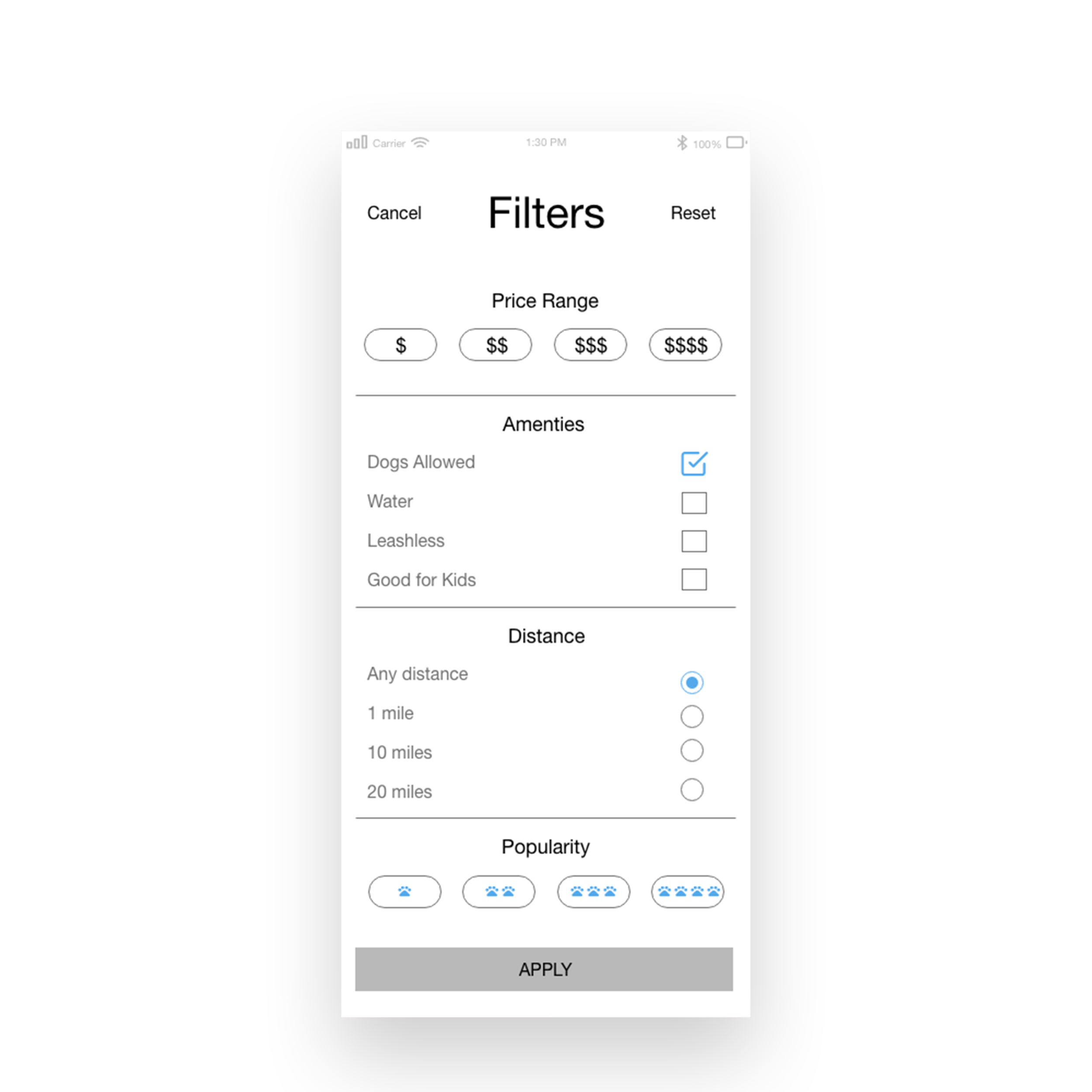
Filters Menu
Allows users to customer searches with options varying from price range, amenities, distance, and popularity based on other user’s reviews.
The Challenge
A location’s pet allowance and accessibility needs to be easier
for pet owner’s to determine.
As the user experience design lead, I collaborated with a UX researcher and software developer
to introduce a user friendly app that assists pet owners in this mission.
During this 6-week design sprint, I was responsible for assisting in user research and
analyzing data, wireframing, running testing, and creating deliverables.
The Research
In-person and phone Interviews were carried out during the initial 2 weeks of this design sprint after candidates qualified via a pre interview survey. This included 10 target audience members. I assisted the UX researcher in creating the interview topics and conducting interviews.
What we learned : interview results
Pet owners like to take their pets places with them frequently
Pet owners cannot often find information regarding a places pet policy, atmosphere, and accommodations online
Most online information provided to pet owners comes from customer reviews and not directly from a place
Deduction: Pet owners are not often provided enough direct, accurate information to make an informed decision on where to take their pet
Psychological implications: One of the reasons Pet Places was created was inspired by a joint study published by UC Berkeley and California State University that determined pet owners are often “helicopter parents.” They often couple strength of affection with neuroticism when it comes to their pets, which I then confirmed in interviews and user testing. Pet parents were very adamant about the importance of their pet’s happiness and wanted every detail of a location they are considering taking their pet provided.
What target audience members are saying
“The current apps I use don’t provide information directly from venues. I have to scroll through user reviews trying to find out if my dog is allowed to go there with me. So frustrating.”
“I usually end up having to walk into a place and ask the staff if my dog is allowed to come in with me.”
“I love taking my dog with me everywhere, but sometimes it is too frustrating to find a place where him and I can go together so I end up having to leave him at home.”
Listen in
Analyzing the data
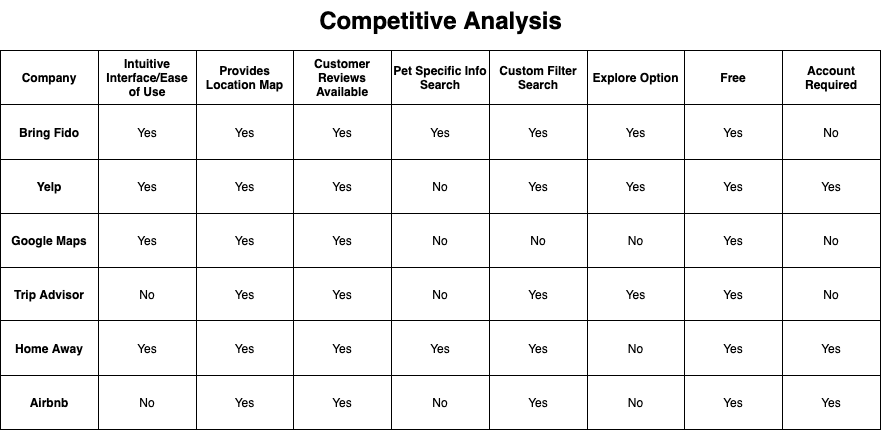
We used competitive analysis to determine what apps out there were currently offering and where improvements could be made within our own app. We focused our design on pet specific information searches in mobile form based on these results.
Affinity Mapping
Affinity mapping revealed several themes and patterns from user interviews. Some of the more important discoveries were:
a list of locations frequented by pet owners that helped shape the app categories
Information pet owners want but are unable to access in the current market
UX Challenge
One major hurdle faced in the UX process for this project was the content strategy. After determining the categories users wanted featured during research, focus shifted to ensuring the content provided for each place would provide pet owners with comprehensive information that eased pressure points of traveling with pets.
UX Solution
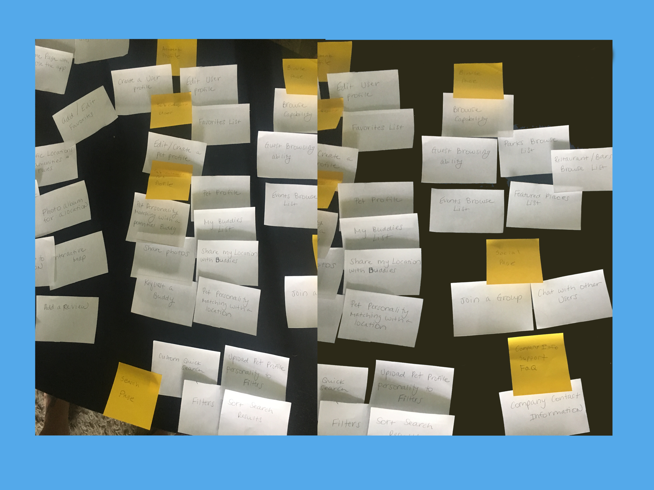
To organize the content strategy for this app, I focused on implementing Hick’s Law to help users achieve their goals of easily locating a place to take their pets. Card sorting was a great information architecture tool we used to help determine categories users would easily understand. All categories were simplified as much as possible and specific images/icons were chosen to ease navigation visually. Page layouts for all locations were also standardized to ensure information was easy to locate.
Card Sorting
One of the information architecture tools we used was card sorting, which revealed common beliefs held by target audience members on necessary categories.
Personas
By identifying common frustrations and goals shared by the target audience through interviews and user testing, personas were generated to help the team better identify with potential users.
Ideation & Wireframing
After completing initial target audience interviews and analyzing the feedback with affinity mapping and card sorting, common themes were determined. These pain points dictated the main focus of the project moving forward.
Paper Prototyping
After initial wireframes were completed and tested, a paper prototype was made to conduct further user testing. We focused on user flow and usability during testing and made design alterations in real time.
Results
During paper prototype user testing, several issues were discovered with the initial designs.
Some initial designs were determined to be competent for a computer screen, but did not work on mobile. Example: The “Search” Arrow at the bottom of the Profile Page and the scroll bar featured in specific category customer reviews. Solution: These elements were removed from the finalized designs and new mobile specific features were introduced.
The Group category was confusing to users and was deemed unnecessary at solving the core problem this app was created to solve. Solution: The category was removed from the final mock ups. The “Buddies List” will fill the social networking gap created by removal of this category.
Wireframing
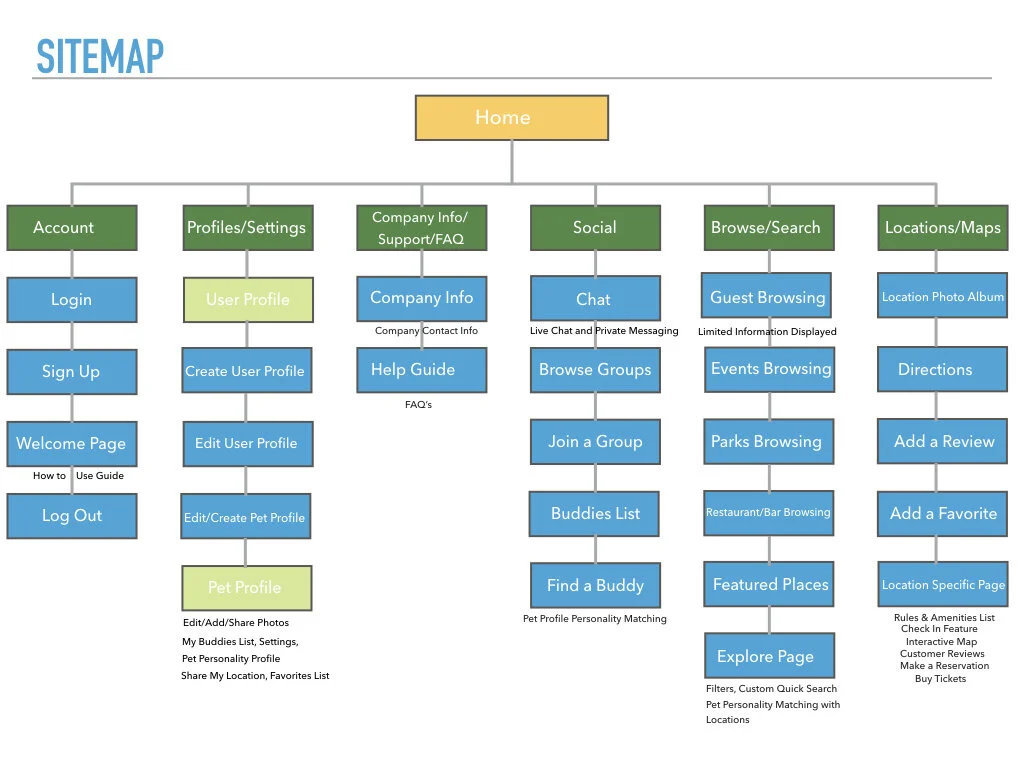
After user testing with the paper prototypes was complete and feedback was analyzed, I created finalized digital wireframes to visualize final layouts and user flow.
The Future
The main goal for the Pet Places app was to ease pet owners frustrations when traveling outside their homes with their 4-legged friends.
Future goals would include signing on more locations to be featured on the app and expanding to a global level.
Key Insights
Throughout this sprint, I learned that user flow can be difficult to determine when dealing with a multi-faceted app such as Pet Places. This demonstrated how crucial user testing is at every phase of prototyping. Initial wireframes were rebuilt throughout to simplify the user experience and declutter each screen. The original designs were more applicable to a full sized computer screen instead of a mobile app. The addition of the Global Navigation bar and a Home Page were significant feature additions in the final phase.


