Usher In
6 Month Contract
Role: UX Designer and Assistant Researcher
Tools: Adobe XD, InVision, and Bubble.io.
The Concept
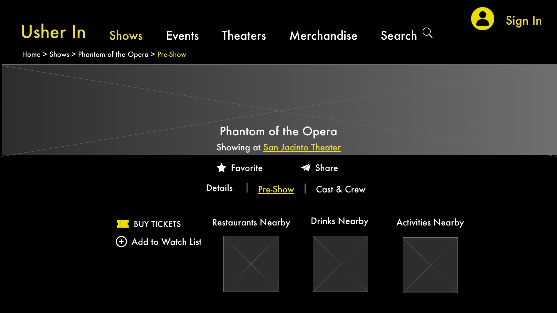
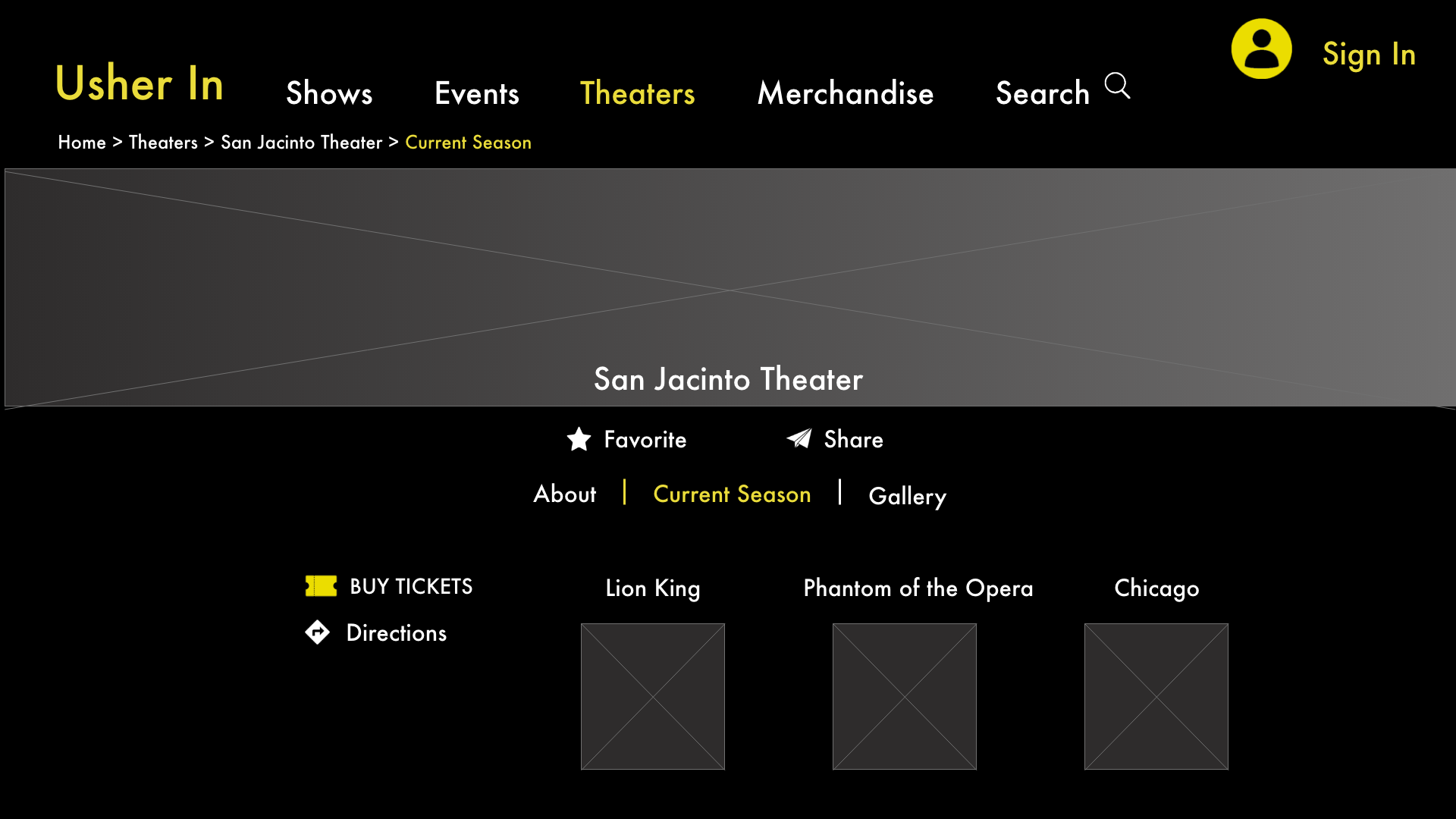
Usher In is an Austin based startup launching a web platform to connect theaters, audience members, and employees together in one digital space. Theaters can sell tickets, showcase upcoming seasons, and sell merchandise. Audience members can book tickets, browse current and future shows in their area, and find restaurants and bars to visit before a show. Employees can network, showcase past works, and find job openings in their area.
By stepping into this open digital market and catering to the theater industry and all of the individuals involved within it, Usher In is hoping to fill this gap and become the go-to website for theater lovers.
The Challenge
Theaters need a better place to showcase their seasons and merchandise, audience members
need a better way to find shows close to their location, and theater workers need a better way to connect to each other.
As the user experience designer, I implemented modern design techniques to offer a simple,
user-friendly interface allowing theaters, audiences, and employees to connect.
As an assisting user researcher, I ensured designs and user flows were backed by research and direct
user needs and wants.
How Might We?
CREATE a web and mobile experience FOR theaters, audience members, and workers TO connect, sell goods, and exchange ideas SO THAT the theater industry can grow and expand in modern terms.
The Research
Phone interviews and digital surveys were utilized for user research due to the current social climate. Target audience members were separated into 3 groups: theater personnel, theater goers, and actors/stage crew. These volunteers were given 3 different surveys and 3 different questionnaires specific to their target group during phone interviews focusing on wants and needs.
Some Example Questions We Asked Were:
Target Audience: Theater Organization Member
1) What is most important thing you want to feature about your theater?
2) If you have a current website, what do your customers complain about the most?
Target Audience: Theater Attendee
1) When you are looking at theater tickets, what is most important?
Price
Proximity to the Stage
Date of the Show
Show Reviews
Proximity to your location
Other, please specify
2) Do you consider yourself a patron of a theater in your area? If so, which one.
Target Audience: Theater Employee
1) How do you meet fellow theater professionals?
2) How do you find current job openings at theaters in your area?
Comparative analysis revealed several things we were not expecting.
1) While target audience groups had already been determined during ideation, we had not considered that an individual could belong to more than one of these groups.
2) Most competitors analyzed offered theater show tickets, however none specialized in personalized experiences for users based on their interaction with the theater world.
3) We also determined no theater website or app in existence currently catered to all individuals involved with the theater industry.
Synthesis
After the research phase was complete, we moved onto creating our personas based on our 3 distinct target audience groups and better understanding what each group needed.
Target Audience Breakdown
Personas
Theater Audience Member
Evan
Age: 26. Profession: IT Manager. Location: New York, NY.
GOALS
Find theater shows near his house
Easily book theater tickets, get directions, and see show reviews in one place
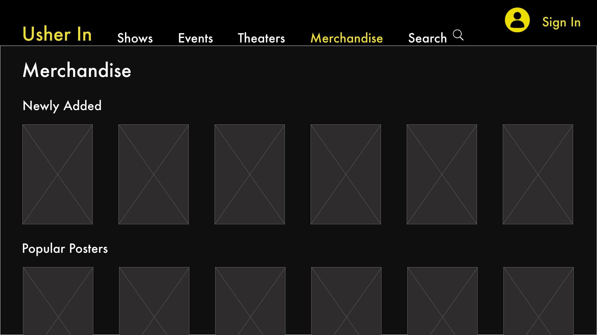
Buy theater merchandise like posters and t-shirts without having to go into the theater itself
VALUES
Trustworthiness
Efficiency
Accuracy
FRUSTRATIONS
Has to use multiple sites to browse theater showings in his area and purchase theater tickets or merchandise (No one stop shop)
Wants to meet more people that also enjoy theater
Theater Organization Member
Doug
Age: 43. Profession: Theater Director. Location: Chicago, IL.
GOALS
Increase audience attendance
Showcase current season, featured actors, and future productions
Manage ticket sales and merchandise offerings in one place
VALUES
Professionalism
Business Oriented
Dependable
FRUSTRATIONS
Uses several websites to manage his theater’s business operations
Has trouble casting shows and staff for productions
No opportunity to connect with other theater directors regarding best practices
Theater Employee
Natalie
Age: 22. Profession: Actress. Location: San Francisco, CA.
Goals
Connect with other theater professionals
Find local castings
Keep her resume updated more easily
Values
Reliability
Social
Timeliness
Frustrations
No online arena to connect with other actors
Issues keeping an updated resume on hand
Missing castings due to disjointed or incorrect information with no single source
Site Mapping
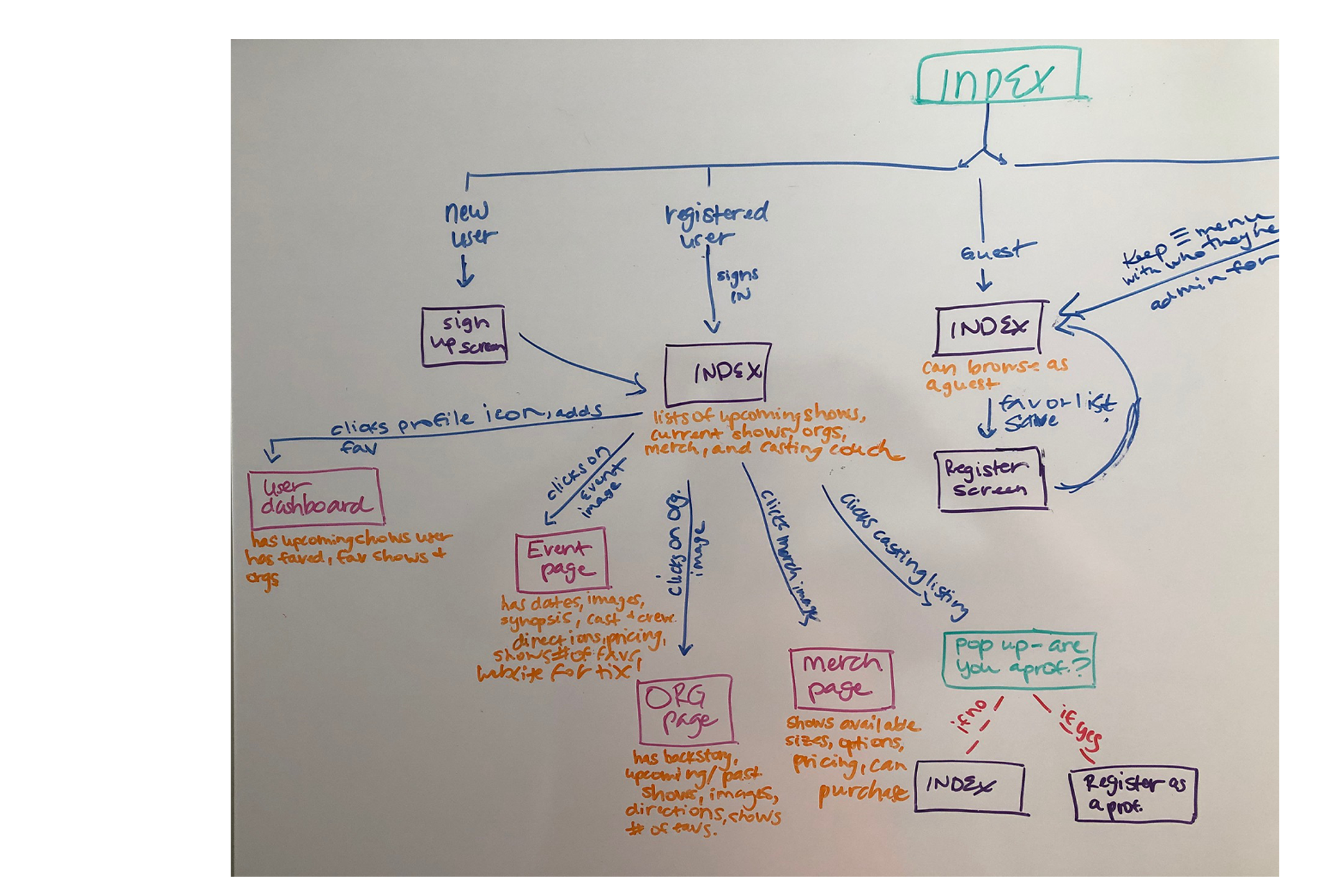
After we determined who our users were and what they valued, we moved onto determining the user journey and site map for the site.
Ideation
After analyzing the research and determining who we were designing Usher In for and determining user journey maps, we began the much anticipated design phase.
Throughout this phase, I worked closely with my fellow user designers and researchers to ensure the business requirements and design goals were being adhered to. I was paired with a backend developer who would advise on system capabilities and technical aspects. I was also in constant contact with the product manager to ensure my designs were on track with business goals.
Testing & Improvement
After initial designs were created and we did some preliminary user testing, we determined several issues that needed to be corrected moving forward.
Originally the target audience group of theater audience members user flow was designed to have their landing page populate as a profile page like the other 2 categories, but we found this group valued going to a Home Screen first. They wanted the most exciting and newest content over viewing their own profile.
During user interviews we discovered that some users would fit into multiple target audience categories, which lead to the issue of what type of screen do they see once logged in. To solve this issue, we created a hierarchy of the target audience groups when they fit into more than one category to determine what the user sees when first logging in or signing up.
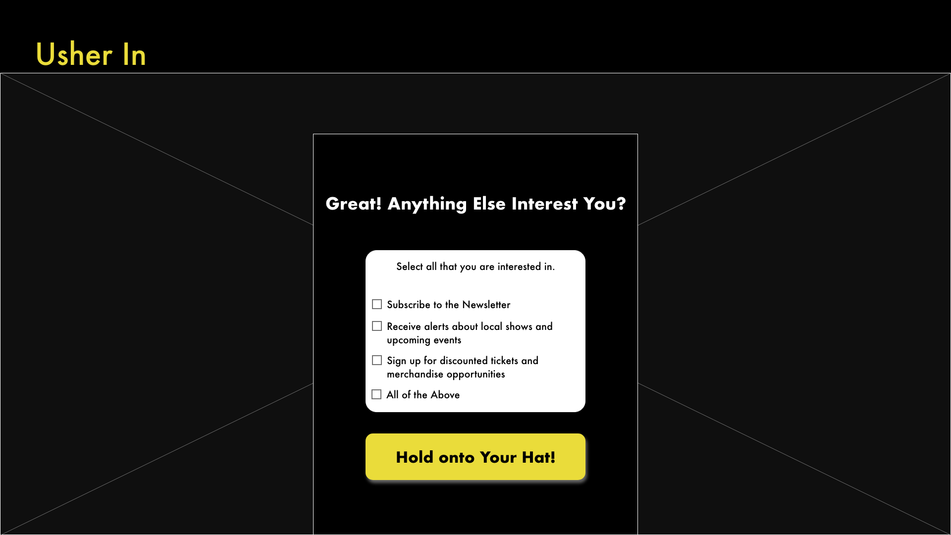
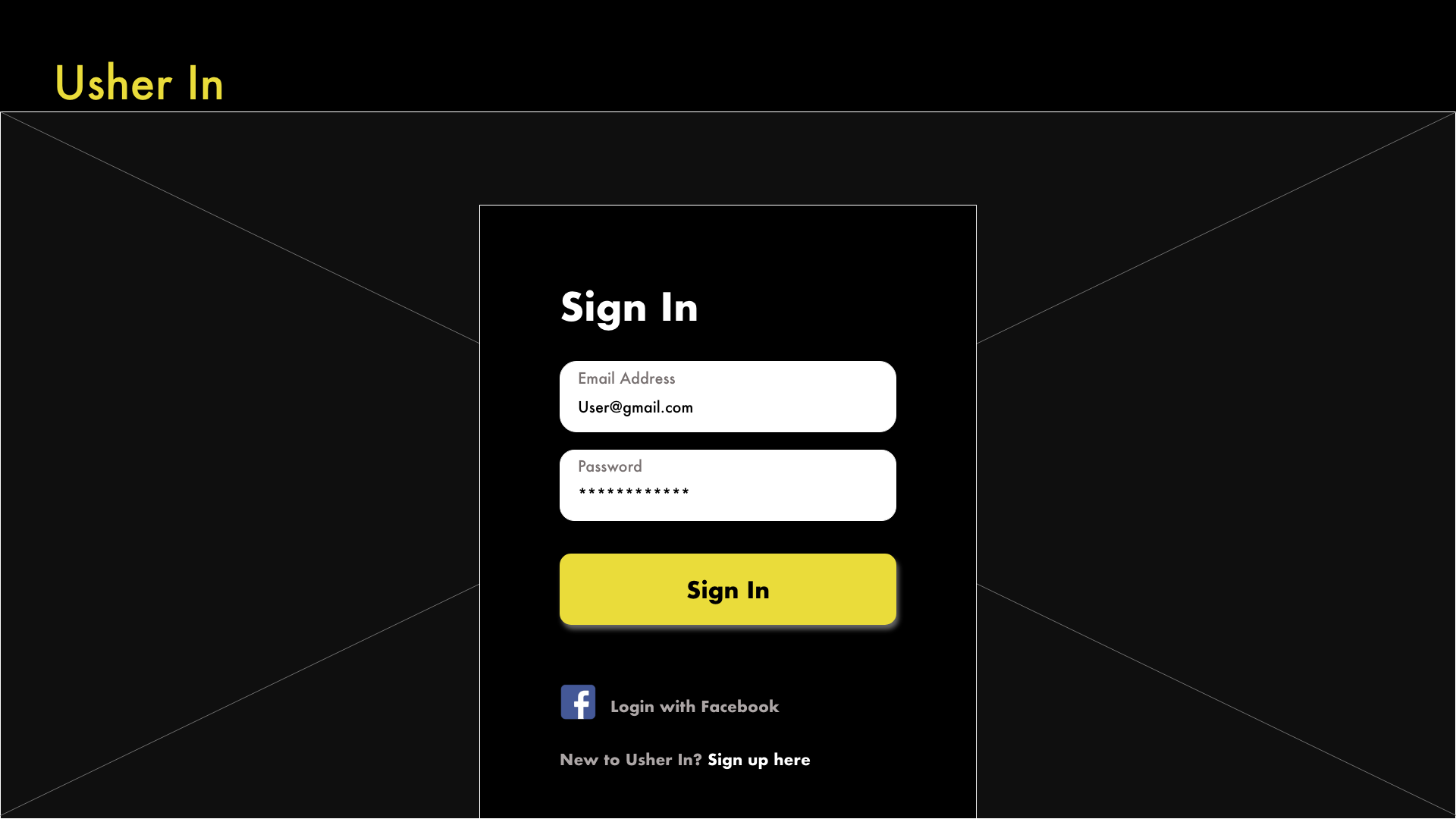
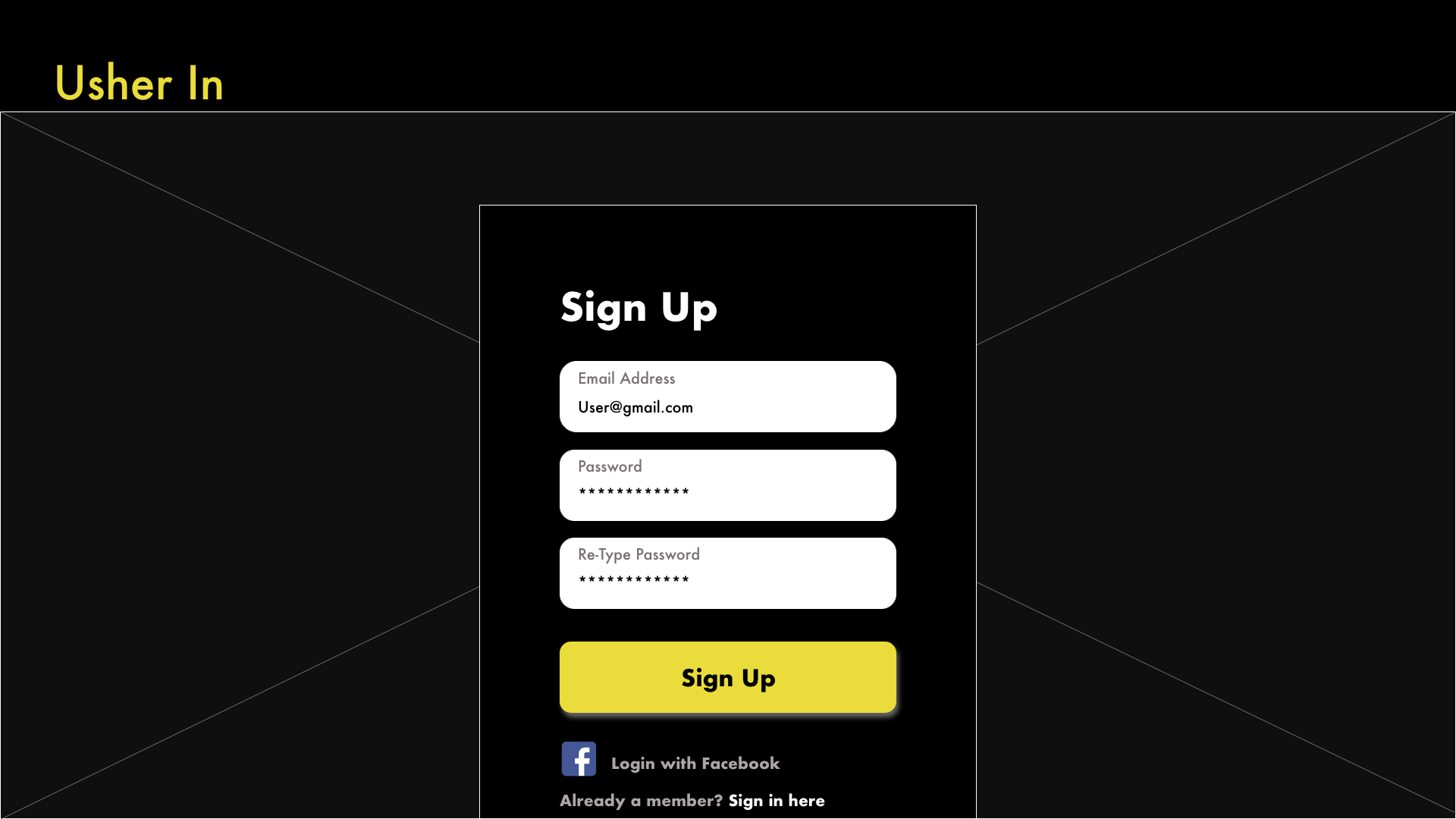
Onboarding was originally very visually motivated, but we determined a more low fi design with better descriptions and questions worked better especially in assigning the user to the correct target audience group.
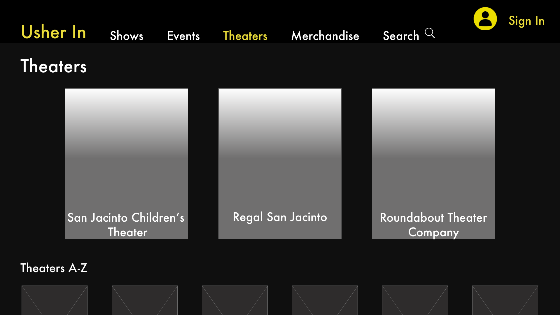
Going against common white background and implementing a black background created a theater experience for the user.
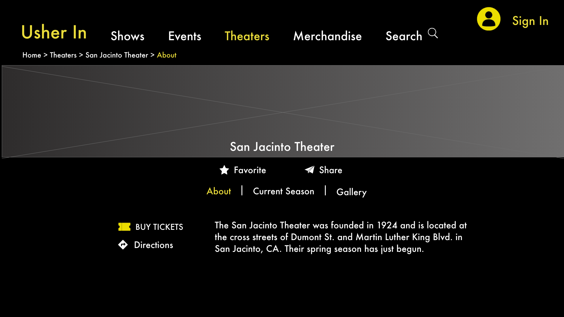
We were going to upload maps to the featured theaters into platform, but found that linking to existing maps such as Google and Apple made more sense.
UX Challenge
One of the most challenging aspects of designing Usher In was creating distinguishable portals and screens for each target audience sector while keeping the site cohesive. Each target audience group presented different challenges, needs, and wants for their Usher In experience.
Creating the Solution
Theater Audience Members
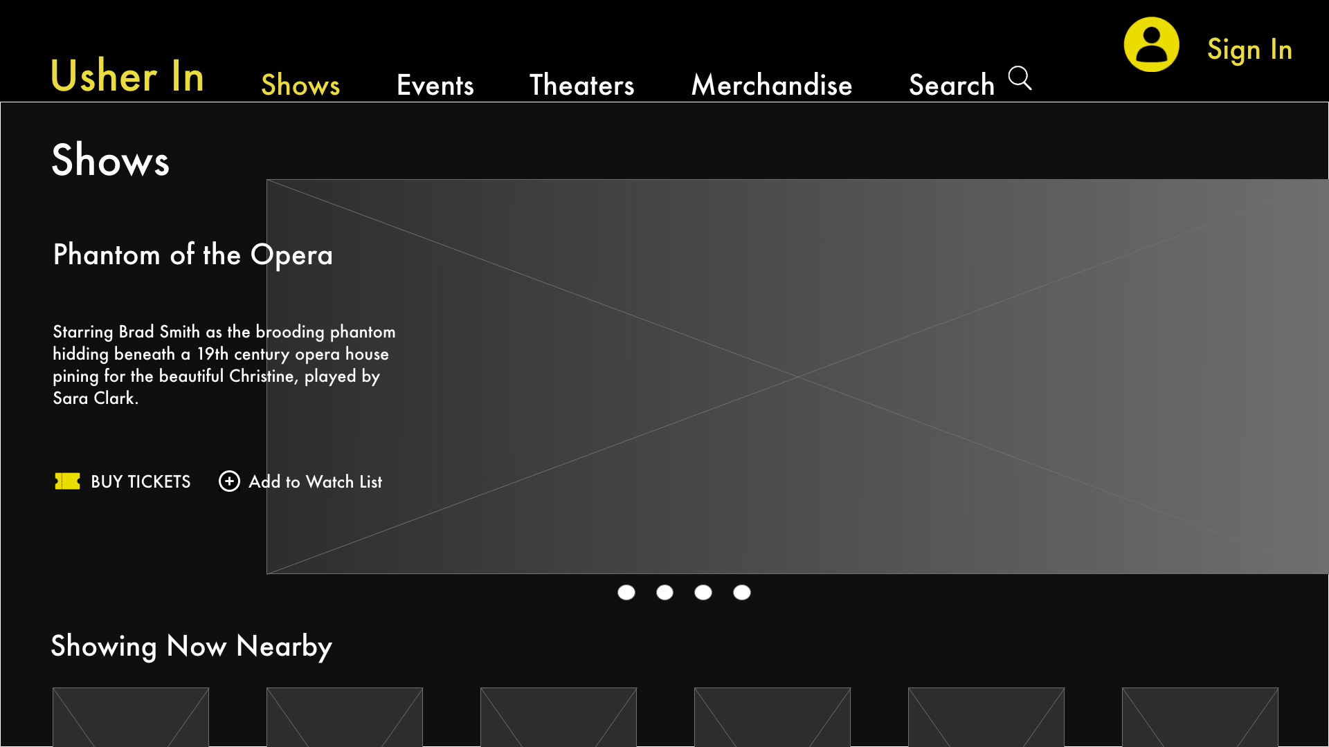
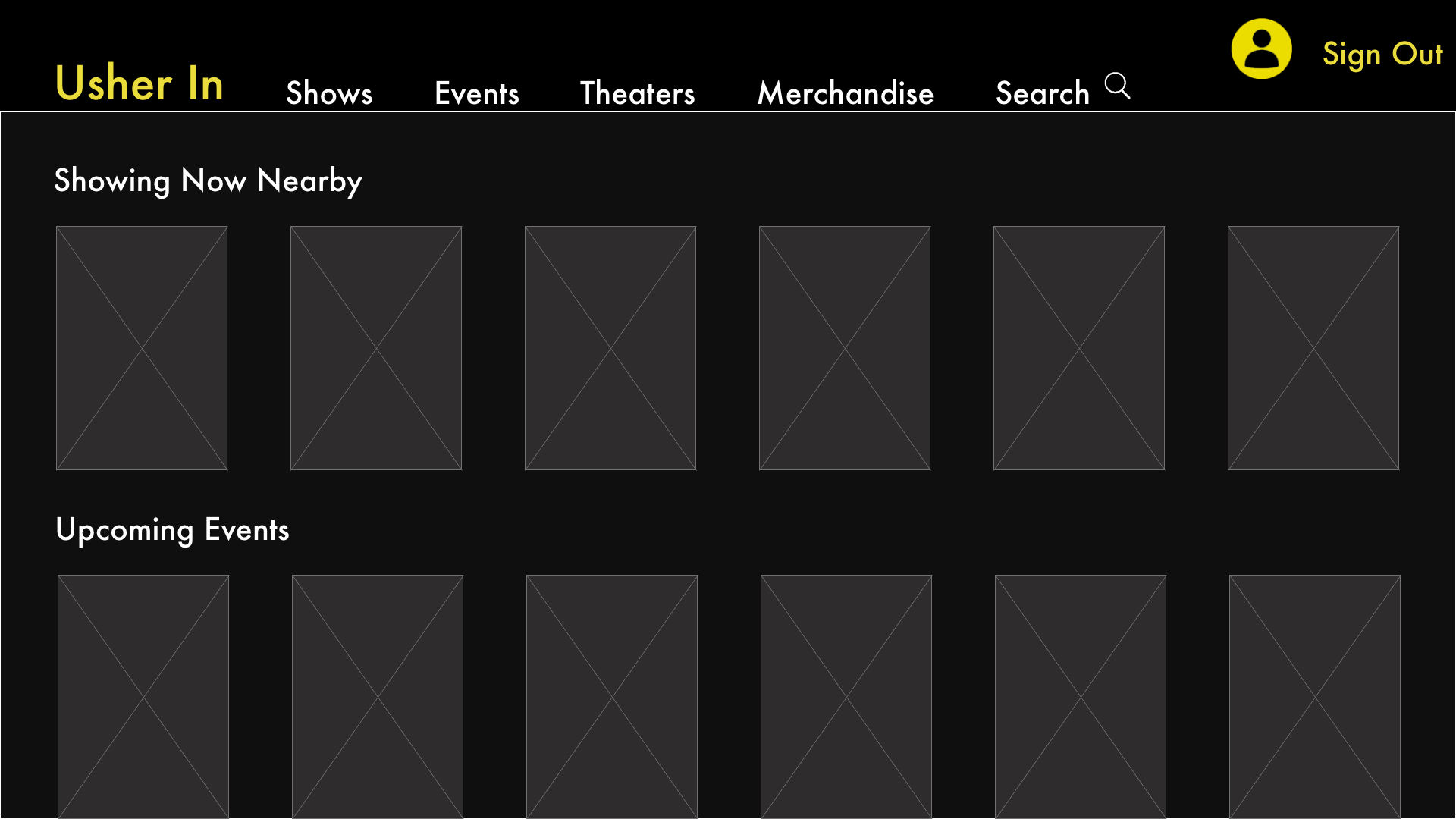
Once an audience member user logs in they see the screen displayed here. This page focuses on:
on the entertainment aspects
Key Features include:
current shows nearby based on user GPS location
upcoming shows and events in the user’s area
easy accessibility to achieve this user’s goals such as merchandise sales and show ticket purchasing
*Note if the user is browsing the site as a Guest, this will be their landing page as well.
Theater Organizations
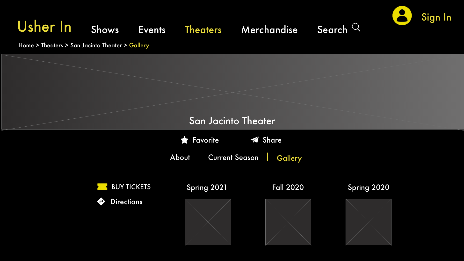
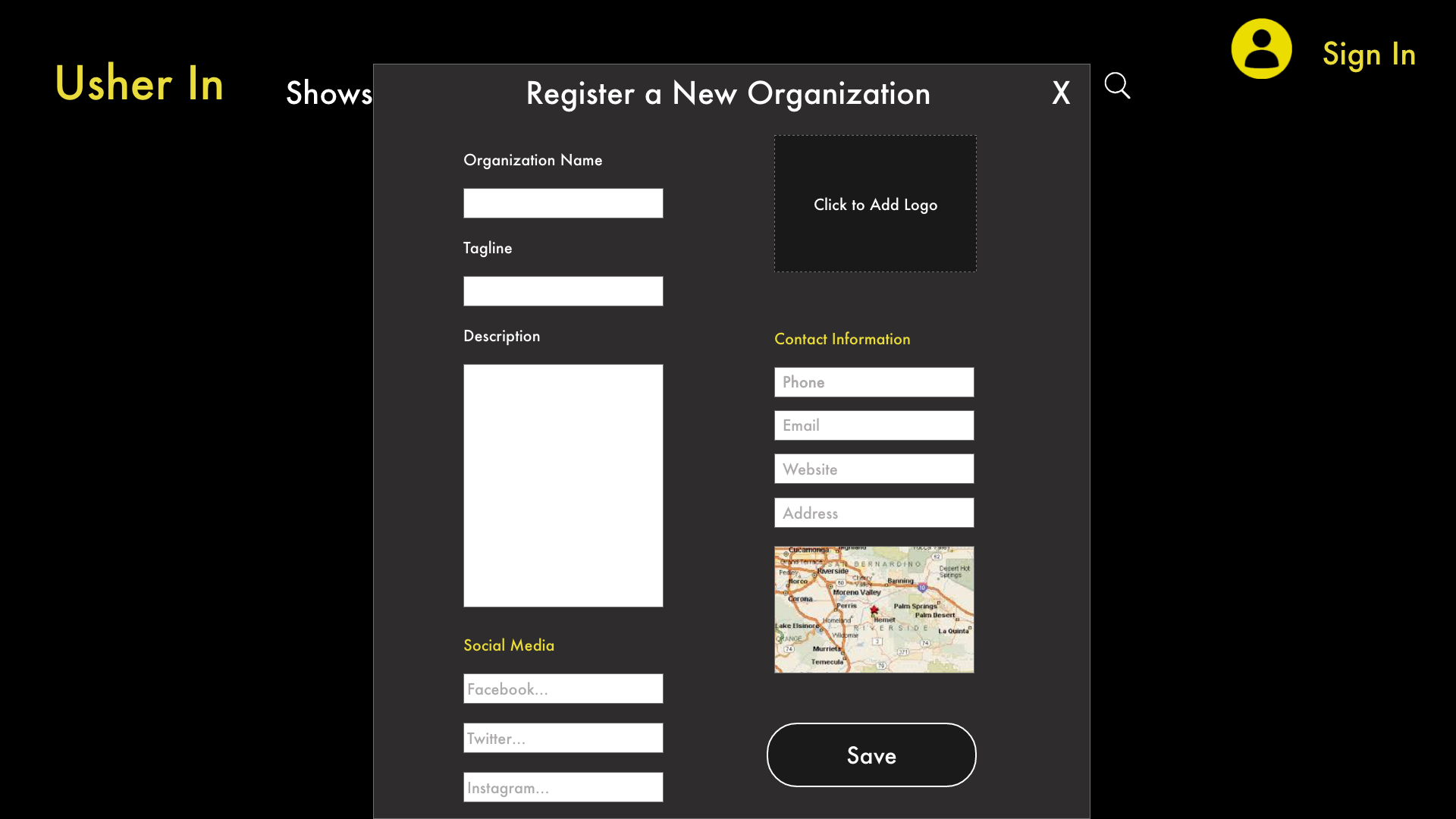
Once a theater organization user logs in they are directed to their profile page. This page focuses on:
managerial aspects
Key Features include:
Updating business account information
Creating and updating events and show information
Feature performing staff and workers
Uploading image galleries
Theater Employees
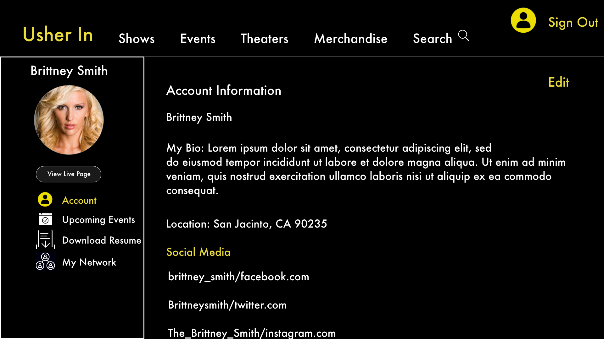
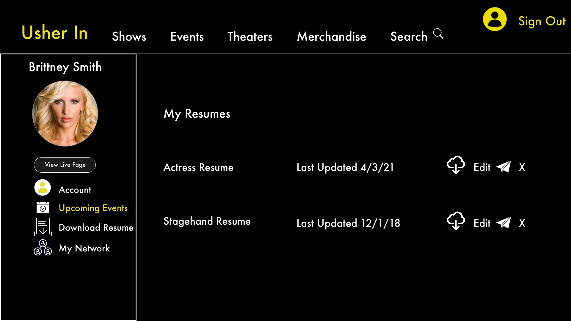
Theater employees such as actors and stagehands are directed to their profile page once logged in. This page focuses on:
career management aspects
Key Features include:
Managing account and contact information
Featuring future and past shows the employee was a part of
Store and update resumes and headshots
Create a network within Usher In to create and maintain business relationships
Onboarding
Besides educating users on the offerings of Usher In, the main purpose of the on-boarding process is to determine the type of target audience member signing up to use the site. This is extremely important because it guides the user to the correct landing page and profile builder where applicable.
Main Screens
Category Specific Pages
Post-Launch
Following the launch of Usher In, I would test the site’s success through several methods.
A/B Testing
User Testing including metrics such as length of time spent on a page or feature, pinpointing when carts were abandoned, etc.
Next Steps
Usher In is striving to become the premier entertainment platform for theaters, theater goers, and people employed by theaters. Some of the future goals for this web platform include:
Design Goals
Aid theater staff in making network connections and hosting a social platform where they can connect with others in their professions.
Create more complex profile pages for users who fit into more than one target audience category.
Create a backend platform that allows theaters to upload content directly.
Business Goals
Launch at the end of 2022.
Continuing to expand the number of theaters hosted on the platform.
Expand the reach nationwide.


